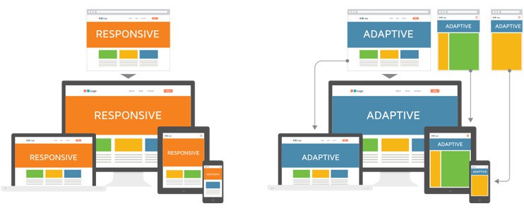
As we already know Google has always recommended responsive web design (RWD), especially after 4/21/15, when they rolled out a big update which ranked mobile-friendly websites higher. But what is different between responsive and adaptive design?
1. Responsive Web Design (RWD)
The phrase Responsive Web Design was invented several years ago by Ethan Marcotte being first introduced in his A List Apart article, “Responsive Web Design” and later, his book, A Book Apart – Responsive Web Design. Responsive Web Design (RWD) responds to changes in browser width by adjusting the placement of design elements in order to fit in the available space. Therefore, a responsive website shows content based on the available browser space. If we will open a responsive website on the desktop and then we will change the size of the browser window, the content will move to arrange itself optimally for the browser window. On the other hand, on mobile phones, the process is automatic: the website checks for the available space and then presents itself in the perfect arrangement.
So, responsive design works on the principle of flexibility – a single fluid website that can look nice on any device. Using media queries, responsive images, and flexible grids responsive websites create a user experience that flexes and changes based on various factors.
Nowadays, the majority of new websites use responsive, which has been made easier thanks to the availability of themes accessible through CMS platforms such as WordPress, Joomla and Drupal.
2. Adaptive Web Design (AWD)
The phrase Adaptive Web Design was invented by Aaron Gustafson, who wrote the specific book with the same title. Adaptive design, uses static layouts based on breakpoints which do not respond once they are initially loaded. Thus, Adaptive Web Design (AWD) works to detect the screen size and load the suitable layout for it. Generally there are six common screen widths: 320, 480, 760, 960, 1200, 1600 pixels.
Adaptive is highly used for retrofitting an existing website in order to make it more mobile friendly. This allows you to take control of the design and thus, to develop for specific, multiple viewpoints.


